Acrylic Pour with Negative Space: What is It & How to Create It
When I first started acrylic pouring, I would frequently mix too little paint. Without enough paint, the corners of my canvases didn’t get covered completely. A lot of these first paintings looked incomplete and I ended up either throwing them away or painting over them. There was one that turned out beautifully, however. This was my first introduction to appropriately used negative space, albeit on accident.
To acrylic pour with negative space you create space around and inside that painting that helps the viewer focus in on the main, or positive, part of the artistic composition. This negative space can be complimentary to make the composition pop, or subtle to limit distraction and provide the background for the main focal point.
In this post, I’ll dive into the definition of negative space, examine a few of the primary reasons acrylic pour artists use negative space in their works and highlight a few of the techniques that pair well with negative space.
What is Negative Space
Negative space is the area around the main focal point of the painting. It is the light between the trees, the ocean behind the boat, the field behind the baseball players.
Many artists use negative space to accentuate where they want the viewer to look at in their artwork. This can be done by using complementary colors to make a deep contrast between negative and positive space. It can also be done by using more muted colors to make the negative space blend in more and to not catch the eye as much.
One of the most famous uses of negative space is Rubin’s Vase. This picture shows two identical silhouettes of a person’s face staring at each other from the opposite sides of the composition. The space in between the faces makes the outline of a chalice.
In Rubin’s Vase, the picture has the faces either black or white. The chalice is then colored the opposite. Each viewer’s eye is attracted to one or the other image.
However, with additional viewing, the opposite image can also be brought to the forefront. This use of color and negative space allows the artist to help guide the viewer to see what they want them to see
A great explanation of the use of negative space can be found on the website mymodernmet.com here.
How to Use Negative Space in Acrylic Pouring
Acrylic paint pouring is generally considered an abstract art because in most cases fluid pour artists are not painting a specific scene, person, landscape, or object. Pour artists are letting the paint do most of the work.
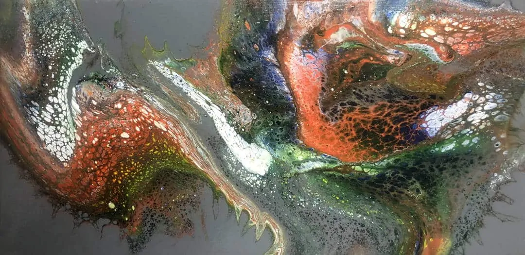
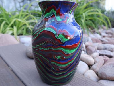
In most cases with acrylic pouring, the negative space is a solid color that is usually painted or poured onto the surface surrounding the main pour. In both bases, once the pour is complete, this background or negative space is still present to some degree.
Even with abstract acrylic pour art, negative space can be used to help draw attention to a certain part of the painting, to balance a composition, or to provide proportion and a frame of reference.
Drawing Attention with Negative Space
The most common use of negative space in fluid acrylic painting is to help draw attention to the main pour area. As the artist, you want to attract the eye of the viewer to the interesting parts of the painting.
If the background of a painting is busy or garish it can detract from the overall look of a painting. One the other hand, negative space that is too much like the primary interest area can also make the eye wander rather than stay focused on what should be the most interesting parts.
Balanced Composition
You have probably all seen a picture at one tie or another that just doesn’t feel right . . . unbalanced. The overall feeling of a paint pour is also affected by balance. Colors, weights, brightness, size, and quantity can all influence the balance of a composition.
Balance does not refer to the different elements attracting the eye equally. It refers to the desire of the painter to give emphasis on different parts of the composition. Some painters want the view to feel off-center or unbalanced while others would rather the feeling of harmony and coordination.
For example, a truly balanced painting could have blues and greens on one side and reds and oranges on another with white negatives space in between and around the areas of color. The negative space adds separation and brightness to two opposing temperatures of color. The opposition is evident but feels centered and balanced.
Conversely, a small dark area with the rest of the painting being a different dark color can feel disjointed and unbalanced. This unsettling phenomenon can be created with different sizes and different color combinations between the positive and negative spaces.
Provide Reference and Proportion
Negative space can also be used to help give a reference point or to provide proportions to a painting.
Proportions refer to the relative size compared to something else. With a pour painting, a common use of proportions is when the negative space is added to all four corners of a rectangular surface.
This emphasizes that the positive space is smaller than the canvas rather than larger while the rest of the painting is unseen due to the limitation of the size of the painting surface.
The use of a large swath of negative space and a small amount of positive space immediately pulls the eye to the main positive space. The negative space acts like big blinking arrows on the canvas pointing to the place where you should direct your eyes.
Negative Space Colors
Using neutral or contrasting colors for negative space is a great way to direct the eyes to the designated area of the pour without causing undue interference.
White Negative Space
Using white or off white as your negative space color evokes a feeling of brightness, cleanliness, or sophistication. White negative space also gives airy feeling It goes will with more vibrant colors as it is also ads a bit of contrast.
Black Negative Space
Black negative space brings out a darker side. It provokes a sense of deep thought and a little bit of menace.
By using black with very light/bright colors you can also arouse the feelings of hope and wonder (think Nasa space photographs).
Contrasting or Complimentary Negative Space
On the color wheel, complementary colors are those on the opposite side of the color wheel. Black/White, Orange/Blue, and Yellow/Violet. Complimentary colors are also known as contrasting colors.
Negative space is the area between the primary focal point of the composition. By using a contrasting color in your negative space, you make the two really stand out from one another. Many complementary colors create dissonance and disharmony.
Black and white are a bit of an enigma as complementary colors because they can easily be both jarring, as they are with Rubin’s Vase, or they can be elegant and normal as they are with text on white paper.
Common Techniques Used for Negative Space Pours
Negative space can be used with all the different acrylic pour techniques. However, some lend themselves more readily to applications with negative space.
More information about different acrylic pouring techniques can be found in our blog post about Basic and Advanced techniques.
Blown Pour (Dutch Pour, Blooms Pour)
A blown pour, otherwise known as a Dutch pour or a bloom pour, rare covers the entire surface of the canvas. This pour relies on a small amount of paint being blow into a base coat.
This base coat that covers a good percentage of the canvas is not the primary focus of the painting. As mentioned previously, the color used for the base coat can help evoke different feelings.
Blown pours can be done with lines or squiggles of paint across the canvas or multiple small puddles of paint also.
Many blown pours are done on simple black or white negative space backgrounds although artists like SheleeArt are more frequently using other base colors with stunning results.
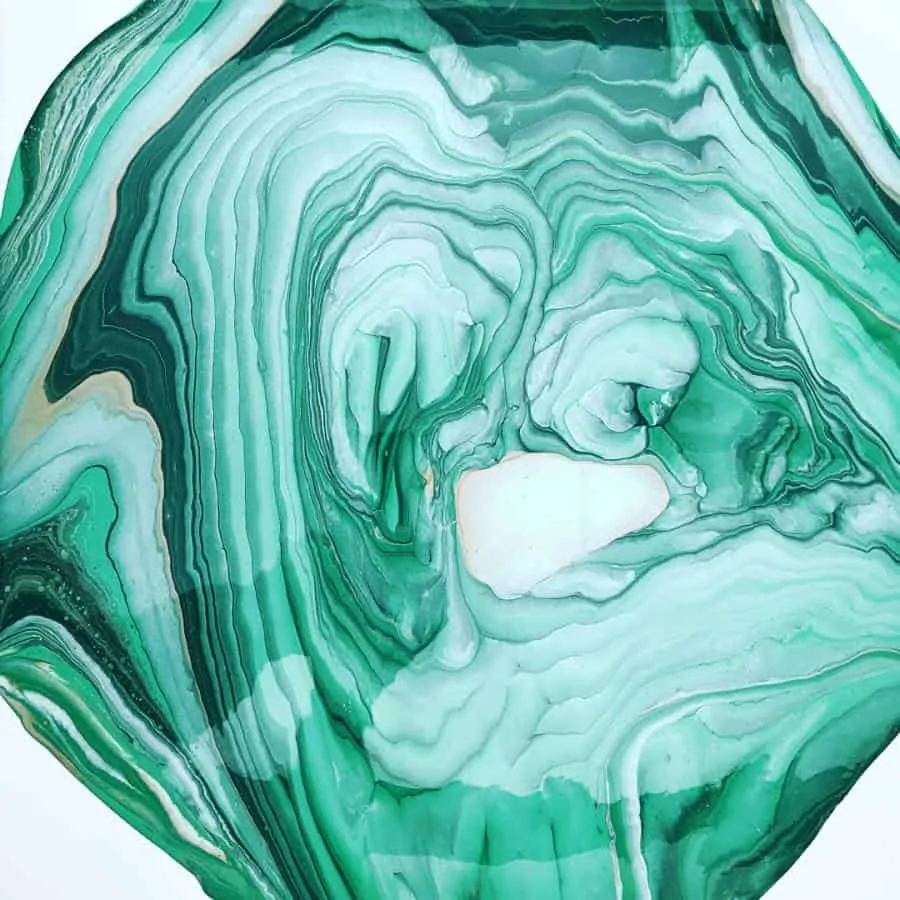
Ring Pour
The ring pour gets its name because it looks like the rings of a tree trunk when cut. The ring pour often has a circular look although some waviness occasionally introduced due to tilting.
Because this pour is often circular and many painting surfaces are square, it presents an opportunity to leave some area of the surface unfinished.
That unfinished area becomes the negative space of the piece and accentuates the difference between the shape of the composition and the shape of the canvas.
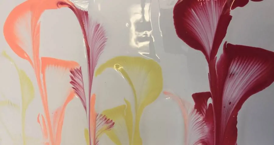
Intentional Pour (Wave Pour, Silhouette Pour)
With the save, silhouette, or intention pour the artist is trying to create a specific shape. These shapes only cover a portion of the painting surface.
Negative space is used to give provide an outline and a barrier that emphasizes the desired shape.
String Pull Pour
The string pull pour techniques requires that you pull a chain or string with a color on it through a different base layer color. This base layer acts as the negative space which is behind and between the colors left behind on the string.
There are a few forms of the string pull that consume the entirety of the painting surface but those are much less common than those that take full advantage of negative space.
The string pull pour technique is also unique in that it can be used on top of a different kind of pour. This creates negative space that isn’t all the same color as the underlying pour has its own color palette and texture.
The designs created by the string pour become the focal point of the piece while the fluid pour behind becomes a compliment to that focus . . . thus negative space.
Traveling Flip Cup or Floating Cup
The floating cup technique uses a thick base layer of paint. A small dirty pour cup of paint is then overturned on the base layer and the paint is slowly released from the bottom of the cup as the cup is moved in different directions on the canvas.
The small cup on top of the base layer appears to float across the canvas as the paint is released underneath which is the reason for the floating cup moniker.
These techniques almost always have lots of negative space around the main areas of the pour. These pours use full advantage of the ability of negative space to provide proportion and balance along with focus and reference.
Conclusion
The use of negative space in your acrylic paint pours bring lots of different perspective and possibilities to your fluid artwork.
When painting, always consider what you want the beholder to see immediately, how you want them to feel, and where you want their eyes to wander. This attention to both the positive and negative space in a composition can expand the depth of a piece and increase both its value and appeal.


Thank you, this was so helpful !!
You are more than welcome Karen. Don’t hesitate to ask any questions you have!
Thank you so much I am binging everything you have posted . I would love to make a geode art peace and was wondering if its made by these techniques but with also added gems .
Do you use poring mediums in all the paints even in metallics
For Geode pieces I think using GAC 800 or Liquitex pouring medium works the best as you get that night resin like finish. And yes, I would use it in all the paints you use. Metallics, mica powders, and the like can give some sparkle. Adding painting lines after the fact with acrylic pens can give depth. Stones, crystals, and 3d elements look great too.
David
I have a large canvas that I did a pour on both sides leaving the middle blank, now I’m not sure what to do in the middle to make it all go together. My color’s I used are the turquoise, greens and white also silver metallic. What colors would you use in the middle?
Thank you Linda
Hmm, that is a hard one to answer without being able to see the painting. Can you send an image to the contact us form on my website (in top menu)?
I’m trying to understand the concept of using negative space, on purpose & have reread this whole thing a couple times already, but I just don’t get it…yet. Concept of using ‘negative space’ must come from part of brain where math, numbers & linear thinking resides (& all things electronic, computer-y), cuz’ I ‘draw a blank’ — that part of my brain is my “dead zone”. But will keep at it. You explain it so well!
I know it should make sense to me. Is it super important to know to do this art?
What you want them to focus on is not the “main” thing in the picture. Easiest shown when you leave a background one color and only paint a small portion of your canvas. The main thing is the background as it takes up the most room. But you want them to focus on that little bit of color you put on the canvas.
How interesting that using contrasting colors for negative space directs the eyes to the designated area. I am building a new home this year and starting to plan the decorating. I will find a good abstract acrylic painting for sale in my area.
Hope the construction goes well Dawn. And that you can find a piece of art that fits your home and your style.
How interesting that you mention and show how the string pull pour technique works. I am building a new home this year and working on the aesthetics. I will find an excellent painting company to help me with my colors.
Thanks for commenting.
No question, just want to thank you for having such a left brain. It is so nice to read your replies and your answers with such certainty and precision so that a right brain can comprehend and understand.