Why is My Acrylic Pour Muddy? And How to Avoid the Mud.
Have you ever laid out a beautiful assortment of colors for your fluid acrylic pour only to realize that when the colors are mixed, they look muddy and unappealing? It is disheartening to enjoy doing a painting so much and then have the result be subpar.
So why is your acrylic pour muddy? The four primary factors to a muddy pour painting are the color selection, the paint density, the paint consistency, and the amount of mixing done before and after the paint is spread on the painting surface. Other variables like paint additives, the quantity of paint on the surface, and the focus of the painting can also lead to muddying.
We will be exploring each of these components which contribute to muddy acrylic pours and providing a few tips and tricks on how to avoid creating a dreaded dull painting.
The Primary Factors that Cause a Muddy Pour Painting
As we mentioned previously, there are four main reasons why your fluid paint pour is turning out to be an uninteresting mashup of misfit colors.
Reason #1: Color Selection Makes a Huge Difference
You are probably not going to be surprised that the main reason for an acrylic paint pour looking muddy is the choice of colors.
The beauty of an acrylic pour is the unique way that colors naturally react with one another to create interest drawing appeal for the viewer.
While every person doesn’t see colors the same, there are some basic rules to know about colors to help guide you as you start on your pain pouring journey.
Check our our Best Acrylic Paint for Pouring article to find great paints to use in your next acrylic pour project.
Get to Know the Color Wheel
If you are an experienced artist, you may already have a healthy appreciation for the color wheel and its many benefits. If you’re new to art, like we were just a few years ago, then we highly recommend you print yourself an example off the web or buy a sturdier version like this color wheel from Amazon.
We’ll be going over some specific tips and tricks on using the color wheel to select the right colors which will help mitigate the creation of muddy colors. These tips will be specific to acrylic paint pouring. If you want a more in-depth guild to color theory, we recommend you read this article from Lifehacker.com
Color Wheel Glossary
Here is a quick glossary of a few common color theory terms that we’ll be using.
Primary Colors – The colors red, yellow, and blue.
Secondary Colors – The colors orange, violet, and green. These are created by combing two of the primary colors.
Tertiary Colors – The colors red-orange, yellow-orange, yellow-green, blue-green, blue-violet, red-violet. These are created by mixing a secondary color with one of its parent primary colors. (Note: Crayola has much cooler names which you are probably more familiar with)
Warm Colors – The half of the color wheel from red to yellow-green. These colors are associated with the feelings from excitement to rage. Neutral colors brown and black are frequently associated with the warm colors.
Cool Colors – The half of the color wheel from purple to green. These colors are associated with feelings of peace and soothing. Cool colors can sometimes recede into the background of a painting giving the illusion of more space.
Hue – This is color family in its purest form. The colors yellow, orange, red, violet, blue, and green are the main hues most people think of.
Tint – The colors created when mixing a hue and white. Used to lighten a hue.
Tone – The colors created when mixing a hue and grey. Used to dull a color.
Shade – The colors created when mixing a hue and black. Used to darken a hue.
Basic Color Schemes
The most effective way to avoid creating muddy colors with your color selection is to stick with some basic color schemes.
Monochrome – Colors that are all in the same color family: for instance, using multiple colors of blue tints, tones, and shades. An example would be a black and white acrylic pour or a pour that uses blue, navy blue, and baby blue.
Complimentary – Colors that are exactly opposite each other on the color wheel. Complimentary colors are direct opposites and therefore have very high contrast. Use this scheme if you desire a bold statement piece. One of the more famous complimentary color pairs is red and green.
Analogous – Colors that are next to each other on the color wheel. Yellow, orange-yellow, and yellow-green are analogous colors.
Triadic – Three colors that are an equal distance away from each other on the color wheel. These colors have less contrast than complementary colors but still work well together. The primary and secondary colors are both triadic color trios.
Split Complimentary – Three colors consisting of the main color and the two direct neighbors of the complementary color to the main color.
Tetradic – Four colors derived from the two closest neighbors of complimentary colors. You can more effectively use tetradic colors by selecting one as the primary color and then creating accents with the other colors.
Adjust Your Colors to Prevent Muddy Acrylic Pours
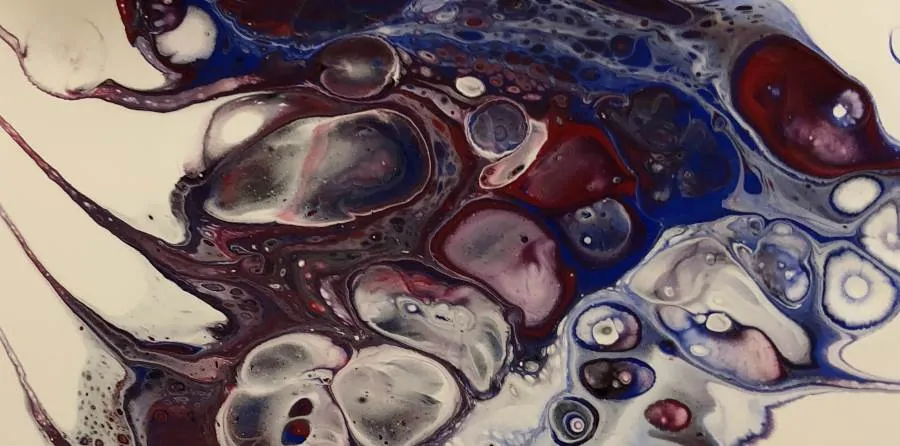
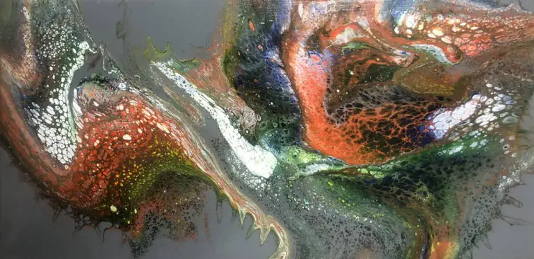
Muddying happens for two reasons. When certain colors are combined, or lots of different colors are combined, they tend to turn into a yellow/brown/black set of colors that reminds people of mud. Hence the “muddy pour moniker”.
The second reason acrylic pours look muddy, is because there is no focal point for the painting to draw the eye. Everything kind of meshes together into a single uninteresting blob.
If you find yourself creating a muddy painting, take your colors to the color wheel and see how they relate. Choose a primary color for your pour and then slightly adjust the other colors to better fit into one of the tried-and-true color schemes. Selecting a primary color helps to keep a focal point for the painting.
We have created many brilliant pour acrylic paintings by choosing random colors from our collection without regard to color theory. However, we have also created several muddy duds. The color wheel is another tool in your arsenal to help you better understand which colors seem to work better together and to help you adjust along the way.
Reason #2: Paint Density Influences Natural Vertical Movement of Pigments
Not all acrylic paints are created the same. Every paint is made from pigments(colors) derived from many different sources including metals, plants, minerals, and more.
How are Acrylic Paint Densities Measured?
If you compare the weight of an equal measure of paint of many colors, each will weigh slightly different. This difference in weight is caused by the various materials used to create the color. Heavier paint has a higher density, and the opposite is true for lighter paints. You can look up the density of your paint with our Acrylic Paint Density Chart.
Golden Artist Colors, Inc. has this spreadsheet on their website where they compare the densities of their different paints. They explain the measurement of density as follows:
“The density is expressed in terms of Specific Gravity, or the ratio of the density of the pigment to the density of water. For example, a pigment with a Specific Gravity of 2 would be twice as dense as water.”
Why Does Paint Density Matter for Fluid Acrylic Paint?
Acrylic paint pouring is the art of putting paint in a liquid form onto a painting surface in a way that makes it interesting to look at. These liquid paints are frequency stacked on top of each other.
When two amounts of paints are stacked on top of each other, and assuming the paints are mixed with the same ratio of pouring medium, the heaver paint will sink through the lighter paint.
This is the “vertical movement” that happens because of gravity. Heavy paints move down. As they do so, they displace the lighter paints underneath. Sometimes those paints are displaced to the sides, and sometimes they are pushed upwards.
How Does Vertical Movement Create Muddy Colors?
Anytime fluid moves around another fluid, there is the possibility that the different solutions will mix. With fluid acrylics, this mixing of paints can cause colors to be created that were not anticipated.
In many cases, this unpredictability of color combinations is one of the stunning features of an acrylic paint pour. In others, the colors combine to create muddy colors that are not satisfying..
How to Use Paint Densities to Limit the Creation of Muddy Colors
Now that you understand how paint densities affect the natural movement of fluid acrylics due to gravity, you can use that knowledge to guess at how colors will interact with each other on your canvas.
Here are a few examples of using paint density to enhance or to limit the vertical movement of paint to avoid muddying:
If you want your dense titanium white paint to drop through the other colors of paint and create different tints, make sure it gets poured on the top of the other paints.
In contrast, if you want to keep your yellow and blue paint from mixing, put the less dense blue paint above the yellow paint. Having the heavier yellow paint already on the bottom when it gets to the canvas keeps it from potentially moving down through the blue paint and creating green.
Paint Additives and Mud Making
Adding other materials to fluid acrylics can also influence if colors become muddy.
Silicone, coconut oil, and other additives are frequently used to create effects like cells in a painting. These additives are generally less dense than fluid acrylics.
Because they are less dense, they tend to bubble up to the surface. As they move, they either move the paint that is above them out of the way, or they bring it with them to the surface of the painting.
Adding alcohol is another common additive in acrylic paint pouring. This helps thin a painting down and gives the added benefit of evaporating very quickly.
When the alcohol evaporates, it pulls the colors around it closer together, which causes more mixing to occur.
Most painters include additives in their paintings specifically to get the reactions we are mentioning. Just realize that this movement causes increased mixing and can contribute to the muddying of a painting.
Learn more about acrylic pour cells in our article here.
Reason# 3: The Consistency of Paint Influences How Quickly Colors Mix
If you have watched any videos about acrylic paint pouring, you probably heard the artist mention that the paints needed to a certain consistency. Some recommend a honey-like texture, while others prefer their paints to be more like heavy whipping cream.
So why does the consistency of fluid acrylic paint matter? A simple experiment is the best way to illustrate how the consistency of paint can affect how quickly paint colors can mix.
A Brief Example of how Fluid Paint Consistency Affects Colors Mixing
Experiment A: Imagine you had two cups of water, one tinted blue and one tinted yellow. If you poured the blue water into the yellow water how long would it take to become green? Would you need to stir it for it to blend together?
Experiment B: Imagine you had two cups of vanilla yogurt, one tinted blue and one tinted yellow. If you poured the blue yogurt into the yellow yogurt how long would it take to become green? Would you need to stir it for it to blend together?
With experiment A, you will find that it takes less than a minute for the color to turn green. Stirring the mixture would speed up how quickly the colors mixed.
With experiment B, the blue and yellow yogurt will not mix very much at all. The only way you can get the colors to blend into green would be to stir them together—for quite a while.
While this may be an extreme example, it shows the basic reason why the consistency of a paint matters with acrylic paint pouring.
Thinner consistency = colors mix more naturally.
Thicker consistency = colors mix less naturally.
Practical Example of how Paint Consistency Affects Colors Mixing
One of our favorite acrylic pouring techniques is the ring-pour technique which we explain in detail in our blog post 5 Basic Acrylic Pour Techniques to Master. When doing a ring pour, you get lots of concentric “rings,”each one having a slightly different color combination.
If you do a ring-pour with thinner paint, the lines between the rings tend to be less defined. Paint mixes quite a lot between rings, and the rings end up being very delicate and wavy.
If you do a ring-pour with thicker paint, the rings tend to keep their shape much better. The color bands do not mix as much, and you get more solid definitions between each ring.
How to Use Paint Consistency to Limit the Creation of Muddy Colors
Muddy pours are more commonly found when the paint is too thin, and the colors mix naturally more than expected. By adjusting the consistency of your paint, even slightly, you can dramatically change the look and feel of a painting.
Naturally Thicken Paint by Letting It Dry a Bit
If you find that your paints are a little too runny for your liking, the easiest way to thicken them up is simply to wait. Paint, especially high flow acrylics, are constantly drying out. Leave your paint in the cup and mix every few minutes; it will begin to evaporate.
If you are going to let it thicken naturally, don’t allow it to make a crust or to dry on the sides of the cup. This will create little pieces of dried paint which become raised imperfections when the paint dries.
Thicken Paint by Adding a More Solid Paint Medium
Another alternative is to add in a little bit more heavy body acrylic paint or a more solid medium like paste. If you do decide to add paste, put the paste in a separate cup and mix small amounts of paint until it becomes more liquified. Then add your new mixture to your cup.
Reason# 4: Mixing Paints Before and After Pouring Can Cause Mud
Paint gets mixed in multiple places during the processes of creating an acrylic pour. When 3 or more colors are mixed, the likelihood of a yellow/brown/black color getting created is quite high.
Here are a few of the more common places where paint in an acrylic pour has a chance to get mixed:
- When adding the pouring medium
- When creating a dirty pour cup
- When pouring the paint onto the paint surface
- When tilting and moving the paint to cover the painting surface
- When doing any of the many advanced acrylic pour techniques like a hammer pour, a reverse pour, a balloon pour, a string pull pour, a strainer pour, etc.
- During the drying process
We know this one seems obvious, but even after years of painting, we find ourselves mixing the paint too much and ruining a pour.
Limit the Mixing of Paints
There are several things you can do to help reduce the amount of mixing that happens during a fluid acrylic pour.
Plan Your Pour
Before starting to mix your paints, plan your pour. What technique, which colors, what is going to be the dominant color, how to center the painting, negative space, what painting surface are you using and how much of it will be covered?
We understand all the decisions can’t be made upfront. This is “art” and there is a whole lot of gut feeling that goes into every artist’s painting. However, by thinking about these details beforehand, you can get an idea of how each of the choices is going to interact.
This pre-planning should give you an idea of when mixing may happen and allow you to decide how much you want it to happen. Once you know that, choosing the right consistency should be much simpler.
Use the Correct Amount of Paint
Many painters, especially those just starting out, have a difficult time gauging how much paint to use for a pour. This is the part of acrylic pouring that is more of a science than an art.
When you use the right amount of paint on your acrylic pour, you limit the amount of manipulation you need to do to keep the right amount on the painting surface.
In our post How Much Paint to Use for an Acrylic Pour we give you an extensive overview of how to best gauge how much paint you’ll need along with a quick reference chart.
Having a Focal Point Can Help Prevent a Painting Looking Muddy
Another less obvious reason that might contribute to a painting can look muddy is the lack of a focal point. Without a focal point, the viewer will look at the entire painting all at once rather than having an interesting section catching their eye and the rest of the painting accentuating that focal point.
When there is a section of a painting that gathers the interest of the viewer, they tend to focus primarily on that point. As an example, a painting that uses a very similar color pattern across the whole painting surface can seem bland or plain. This lack of interest can make a viewer perceive the painting as boring, which is the same feeling a muddy painting would invoke.
Let us just make one thing about focal points. There is nothing wrong with not having a focal point in a painting. Many artists like Jackson Pollack have famous pieces with no focal point. This is just one variable that might be the reason why a painting has a muddy or washed out appearance.
Avoid Muddiness by Creating a Focal Point After the Painting is Dry
One ingenious method to save a muddy pour is to add intrigue after the painting is dry. Many acrylic pour artists embellish their work once it has been given time to cure. By using the “muddy” pour as a background and adding lines, pictures, drawing, text, or other adornments, you can revitalize a pour that is plain.
This additional decoration gives some additional oomph to a so-so painting and adds a focal point to catch the viewers eye.
Conclusion
There are many components of an acrylic pour that the artist can control to limit the amount of muddiness in a painting. Understanding these elements allows the artisan to reduce the possibility of creating a simple pour.
A muddy paint pour is second only to the horror of smudging a beautiful artwork before the paint is dry. No artist wants the result of one of their labors of love to be plain. We crave the extraordinary!


This is probably one of the best articles on muddy pours that I’ve seen. Thanks for sharing!
You are very welcome. We should be adding some additional pictures soon to help illustrate some of the other points.
I completely agree!!!!
Thank you for all the great ‘left brained’ info!
You are very welcome. I’m kind of living the dream right now because I never thought I’d ever feel like a “real” artist. Pouring is my go to stress reliever now.
3 more failed attempts even after your overview and I’m back to read more. I had little pop up blobs in places but mainly blah. Now, after reading this list, i realize I committed one of these errors on each attempt, I can’t justify anymore wasted paint and surfaces, after today’s attempt I’m taking the L. Stop me before I spill again! Thanks for another great breakdown, EP
Hi, this is a great article. I’m hoping you may have an answer to my problem I’ve been having With my painting. Upon drying, my canvases are turning an apricot hue. Worse in some patches than others. Could it be the silicone, Floetrol or one of the colours leaching up through to the top layer as it dries? Even when I turn the canvas around and look at the back of it – it is so apricot! One of the artworks I did was with browns, taupes and white so I have no idea where this colour is even coming from. Help please!!!
So, this definitely happens to me. Especially with certain brands of colors. The colors from Decoart extreme sheen and other acrylic paints are notorious for doing this. Some golds and other pigments also do it.
Floetrol shouldn’t be the cause at all.
Another thing is a unbleached canvas. Some canvases are kind of a beige or tan color and they get coated with white gesso. When the gesso gets wet, it allows some of that color to show through. This doesn’t happen very often in my experience. What brand of canvases are you using?
I’ve been having trouble with my flower pot dirty pours. Instead of having interesting patterns of “mountains and valleys”, which is how it looks when it’s wet, when it dries the paint ends up becoming vertical stripes. Sometimes a little muddy, but mostly losing all the interesting patterns. Could this be due to densities? Any suggestions? Thanks!
Two things come to mind. How thick is the paint? You want it slightly thicker to keep your patterns better. The second is the paint to pouring medium ratio. Make sure you aren’t diluting the paint too much. Craft paints shouldn’t be more than 1:1 with pouring medium and maybe even 1:.5 (paint:medium). Regular soft body acrylic is around 1:2 (check instructions on mediums) and heavy body or fluid acrylic (think Golden here) are like 1:4 or 1:5.
Do you have a chart of what each color weighs so I don’t get vertical mixing?
I don’t. The best thing I have seen is the PDF from Liquitex. That’s an idea I’ll have to think about though.
Thanks for the very useful information on pours!!! It’s hard to find such information.
Thanks Vlad for the kind comment and the feedback on some typo’s. Enjoy your pouring!
Oh yeah and slight typo in this header “Having a Focal Paint Can Help Prevent a Painting Looking Muddy”
Great piece! When I finish my pours, they look shiny, cell-y, and distinct. When I let them dry and come back to them, the shine is gone, as is much of the distinctness. Everything loses its luster and melds together a bit. Any thoughts on how to maintain the “just-poured” look, which I love!
That is the nature of acrylic paints. They aren’t like oils and keep their sheen. However, a good varnish or gloss coat after they have dried and cured will bring that vibrant color right back. As for the pour changing, a little of that is the nature of pours. The liquid is going to shift over time. However, for most people, their paint is too thin which tens to deform more overnight. Having too much additives like silicone will do the same thing also.
Hi David, Thanks so much for your article.
I am having a hard time with my blues disappearing on a black background. Weither I do Dutch pours or swipes, the nice blues that show when wet tend to completely disappear when dry! I always get so disappointed the next day. Would you have a special tip for that? Thank you for your time, Lauriane.
What color of blue are you using? Make sure you are using a more opaque blue (pthalo instead of ultramarine) so the color doesn’t get overshadowed by everything else. Also, don’t use craft blue. If you haven’t, you need to upgrade to at least a student grade blick/liquitex/master’s touch/etc. Those paints have so much more pigment to filler ratio that you’ll get better results.
Thank you! Excellent article. Explains the problems that I gave been having.
Excellent to hear Donna. Don’t hesitate to ask other questions you might have.
After reading, not knowing who had written this article, I thought “gosh that was very interesting and hopefully helpful”. I then scrolled up and say the author and said to myself “of course, it’s the Left Brained Artist”!
Aw, that is so nice. Glad my voice shows in both my Blog and YouTube channel. Thanks Judyl.
Hey, LBA – A question…
I saw a piece of one of your tutorials about stacking paints in a pour cup – opaque, transparent, opaque, etc… My question: Should Transparent and Semi-Transparent (or Semi-Opaque) paints fall into the same category of as opposed to Opaque?
Thanx!
Yes. Anytime you mix medium in to paint they get to be slightly more transparent. That’s the nature of pouring mediums. But as a standard you can definitely treat the “semi” ones the same way Gary.
Just want to thank you for your story above. Now I know what to do. Thank you very much!
It is my pleasure Lin. I love experimenting and adding video and blogs about them is just a cherry on top for me.
Having just discovered paint pouring, I have had hit and miss success with them but this article has been most helpful. I am now off to find your videos on youtube for more tips and ideas. Thank you!
Thanks Marion. Glad to help and I hope you come back when you have more questions. I am always looking for more YouTube and Blog ideas.
This article is so helpful and answered many questions for me. Thank you!
Thanks Sally. Glad to help. Don’t hesitate to ask more questions if you have them. Always looking for new video and blog ideas.
This by far is the best article. You break everything down for a clear and concise understanding.
Thanks so much. Glad to help.